SkyTrail
An iOS application designed to ease a user's flying experience from departure to destination.
#Designstrategy #Aviationdesign #Innovation
★ 4.4 Rating on Apple's TestFlight
About 3,000 beta testers
What is it about?
Over the years, flying has become a tedious process due to the various steps involved such as security, check-ins, and just the process of reaching the airport. All the numerous, variable factors that a user must consider while flying tends to over encumber the user leading to anxiety while flying.
The Client's ask was to build a beta application for their organization to test out new concepts for the aviation industry.
Hence there was a need for the Design to be Modular and Scalable
Research
Prior to the start of the project, a thorough Research Exercise was conducted to gain a better understanding of the customers and the journey they went through while travelling.
A research strategy was devised to gather information to drive the designs forward. This strategy consisted of 3 distinct steps
Research: Step 1
High-Level user Journey
User Journeys are essential for getting a glimpse into what a user has to go through to accomplish a task. The initial user journey was plotted from experience, secondary research and a few high-level interviews
Travel
Preparation
Pre Departure
Planning
Traveling to the
airport
Departure
airport
In-flight
experience
Destination
airport
This initial user journey gives a basic overview of what a user goes through, during their day of travel. It worked as a foundation, upon which questions were framed, to gain more perspective into the unknowns of a traveler’s journey. It also added a more structured approach to the entire research process.
Research: Step 2
Questioning the unknown
To prepare for the primary research exercise, a set of questions were framed keeping the customer journey in mind.
Question Brainstorm
Multiple rounds of brainstorming to come up with a set of open-ended questions to get assumptions answered.
~150 Questions
A Final List
Combined, removed, and rephrased the questions from the various sessions into a final list of 50 questions.
~50 Questions
Research: Step 3
Gathering data
Using the final list of questions, categorized according to the customer journey, a conversation was structured to help get more information from users about their day of travel. F2F interviews were conducted with users.
10 Users
A list of suitable users, who were known frequent travelers, was drafted. They were contacted and time was set up with those who could be interviewed.
~1 hour per user
Interview sessions were conducted and recorded with the user’s permission. Each session lasted anywhere from 30 minutes to 1 hour and 30 minutes
What was found
After crunching the data gathered from the research phase through primary and secondary research, the user arch type and opportunity areas were derived.
The Business Traveller
They are the most technologically savvy, socially driven, economically smart travellers, who travel for the purpose of work or business.
The Holidaymaker
Travellers, whose primary motivation is to take a vacation from everyday life. They usually stay at hotels or resorts, relax or go on guided tours.
The Casual Traveller
travellers who challenge the concept of holidaymakers and prefer exploring new destinations at every single opportunity available to them.

What was found: Output 2
Insights
The research data pinpointed various insights for design intervention to better the user's experience during their travel. The top two pain points users had for each phase in the user journey are as follows.
Travel
Preparation
Pre Departure
Planning
Traveling to the
airport
At the departure
airport
In-flight
experience
At the destination
airport

Frequency of pain points against the user journey
Travel Preparation
-
Users usually packed light to avoid check-in luggage.
-
Users packed according to the weather at the destination.
Pre Departure Planning
Users usually had a mental itinerary after a few trips.
En-route weather influenced a user’s trip heavily
Traveling to the Airport
-
Most users took cabs to get to the airport.
-
Users generally slept, worked, or read en route to the airport.
At the Airport
Most users made it to the Airport just in the nick of time.
If time permitted, they grabbed light eats or drinks depending on the time of day.
During the Flight
-
Most users did not like to be disturbed during their flights.
-
Users preferred catching up on work or rest during their flight.
At the Destination Airport
-
Users wanted to know the time to de-plane.
-
Most users took Rented cars or taxis to their destination ad wanted to leave
Ideation
For the ideation session, a variation of the crazy 8 ideation technique was utilised. At a given time, a single phase of the user's journey was taken and the participants were given a limited time of 2 minutes to come up with ideas that could tackle user pain points for that phase discovered during research.
This was repeated for all 7 stages of the user journey.
8 Participants, 12 Minutes, ~230 Ideas


Prioritisation & Execution
Prioritisation & Excecution: Output 1
Prioritisation Matrix
A prioritization activity was conducted to find the ideas to be targeted for design development.
Each idea was given a score for its 'value to the client' and 'value to the user'. Using these values, the generated ideas were plotted in a graph of 'value to the client vs. value to the user'.
Ideas in the top quadrant were prioritized for design.
Ideas ➞ Grouped into Ideas
All the generated ideas were taken and bucketed and grouped into wholistic features.
Prioritisation & Execution: Output 2
Execution Framework
During the design phase, a single feature was taken up at a time. The heaviest features were taken up first so as to ensure that a concrete design language was set up. The design phase for a feature was executed as follows:


All the research findings were presented to the client, and a collaborative, brainstorming exercise was conducted along with the client team
Usability Testing
After designing a group of features, they were run through users to gain usability feedback. Since this was a beta channel app the usability testing was conducted in two stages,
Design Based Testing
The first stage of testing was carried out during the design phase. Once features were designed and a satisfactory flow was synthesized, The designs were presented to users.
When the designs were presented it was made sure that the flow of being presented to the user was similar to the current scenario they were facing. For Example, when testing for the 'at airport' scenarios were carried out, users at the airport, waiting for departure flights were targeted
Usability Testing: Stage 1
High-Level user Journey
The second stage was carried out during the 'UAT' phase of the product. Each user was Shadowed as they performed certain tasks and observations on how they interacted with the application were made.
The shadowing helped up to pinpoint various issues and problems with the general flow of the application. During this phase of testing, interactions with the users were kept to a minimum so as to not taint the study. Testing was also carried with a developed version of the application.
Usability Testing: Stage 2

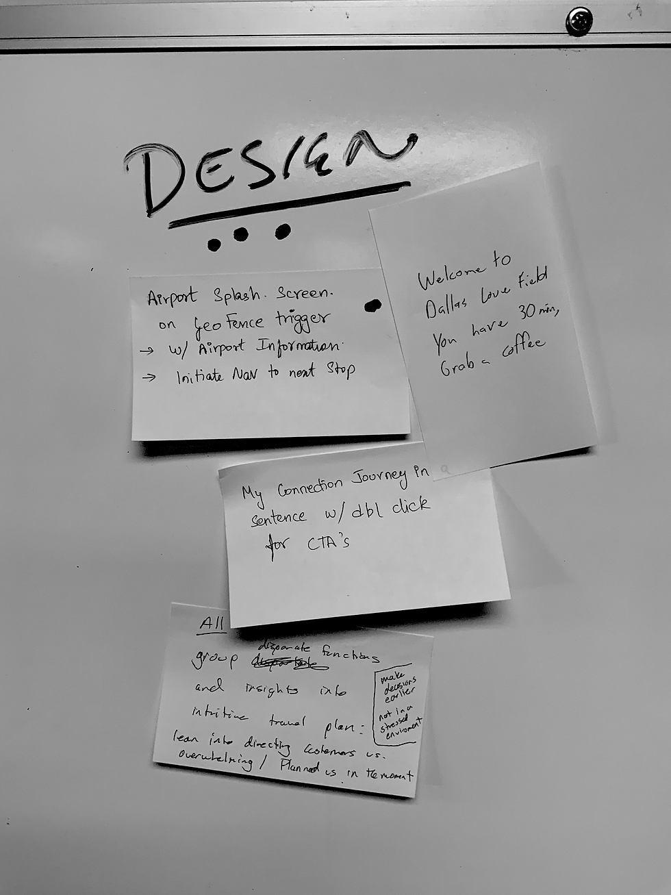
The Solution
The solution devised was to create an application that would help a user from when they leave their start location up until they reach their destination by providing all the information they would need to complete the journey.

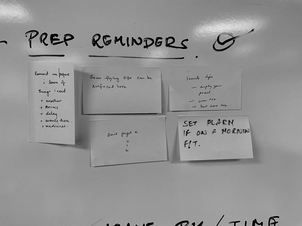
Leave by time
A cumulative time taking into consideration various aspects of air travel such as travel to the airport, security queues, and wait times, helps the user to leave on time.
Contextual Interface
An intuitive and contextual interface that changes to give the user the most useful with reference to his journey. This also helps them view an itinerary which will help them plan for their travel.
The main features of the application are,
-
Next upcoming flight
-
Other upcoming flight
-
Delayed flight
-
Canceled flight
Flight Statues
During the initial phase of the project, there was a discussion on whether to represent a user's booking as trips or flights.
A consensus was reached to boil up flights to the top since the app's main focus, as per the problem statement, was to provide an itinerary for the user from departure to destination
Flights vs. Trips
A singular place with the user's booked flights. The user is shown all the required information about their flights along with crucial statuses about their flights.
This is the first screen that a user is presented with. Each flight card can have a variety of states depending on the status of the flight that the user is going to take.
My Flights

The trail plan gives users an itinerary that helps them from departure to destination. It is based on various conditions and is contextual to the user's phase in their journey.
The trail plan in its entirety helped users by creating an itinerary for them, which they could customize. Through the trail plan, users could plan their journey from their location, whether it be from home or a hotel to their departure airport. The Trail plan helped by providing a suggested time to leave by. The various considerations used to synthesize the suggested time to leave included, but were not limited to:
-
The location from which the user was leaving from
-
Parking times or rental return times depending on the mode of transport the user had mentioned.
-
Time to get to the airport from parking or rental returns
-
Baggage Check-in times depending on the type of Check-in
-
Security times based on the type of security
-
Transit times between the various checkpoints within the airport
-
The departure time of the user's flight.
Trail Plan

As soon as the user is within the airport they are showcased a plethora of information that can help them decide on when to head to the gate.
Using computer vision we are able to showcase the crowd at a particular gate and inform the user if seating is available at a gate or not.
Utilizing a mix of the distance from the gate, boarding time, and a user's boarding position, the user is given an 'Estimated Boarding Time' using which the user can reach the gate when required. This helps reduce overcrowding at the gate and helps reduce turn times.
Real-time seating availability informs the user if empty seats are available at their boarding gate
Gate Awareness

Being Relevant
To make sure the user got the most relevant information each time they opened the application, the Trail plan was designed to show data, which would be most relevant to the user at any point during their journey.
The lower half of the screen provides users with the most crucial information and or action points they might require during a particular phase of their journey. Swiping up reveals the full Trail Plan.
When within an airport, the user is presented with all the required information about the airport. SkyTrail also helps with navigation within the airport
-
Realtime Navigation helps the user find and go to places within the airport premises
-
Locations are suggested to the user based on proximity to the user
-
Contextual suggestions tell the user what they can do at the airport
Airport Awareness

Health Consciousness at the airport
Since user's sometimes spent a good chunk of their travel time at departure or connecting airports, it seemed like the perfect place to encourage a bit of fitness if the time permitted. This was a completely optional feature of the application and made use of apple's Health Kit API.

Contextual Notifications
To provide the user with a more engaging and interactive experience, iOS (as well as in-app) notifications were used. These notifications, as with the trail plan, were tailored to each user's unique journey and the phase-in that journey.
The notifications are displayed within the app as well, iff the user did not enter the app through the iOS native notification. Clicking on the notification respective took the user to the respective screen in the app.
To prevent a jarring experience due to the loss of context, micro interactions were used to tell the user how they reached the screen


The Admin Console was the the interface through which the administrators of the Sky Trail application could manage users, airport Data and Aircraft data all while being able to configure certain parts of the application
Admin Console
Ancillary Applications: Application 1

Ancillary Applications
While building the SkyTrail iOS Application, multiple applications that were to work tandem with SkyTrail or alongside it was designed.
SkyNet was the conceptual part of platform which aimed at providing the airline with information about user whereabouts so as to ensure better customer service and quicker Turn around times for their aircrafts
SkyNet
Ancillary Applications: Application 2


@parthloliyania (UX Researcher) @rebathomasparel (Visual Design Lead). @sakalpaul (Visual Designer)
The Design
The app consists of a few main features which aim to target and solve user pain points. The app in its entirety is contextual to the user's whereabouts and it was designed to be as modular as possible so as the enable the ability to design, develop, deploy and test brand-new features for the users of the aviation industry for the client.
The application provides the user with navigation based on where it is needed. The user can navigate to and from airports and within supported airports based on a third-party service provider.
Navigation
In-Airport Guides
In-Aiport Guides help users to find what they need within the airport. It helps them navigate and show travel times to destinations within the airport.
Contextual Notifications
Notifications that pop up for the user based on the leave by time calculated and help the user to prepare for their upcoming travel to finding things to do at the destination and everything in-between. Care was taken to provide only a set number of notifications for a given flight.
My Role
Innovation Lead, UX Lead; 2018 - 2020
What I was responsible for;
-
Client-facing discussions and Client visits.
-
Driving the product forward with new, innovative and executable features.
-
Pitching new ideas to the clients to propagate more business.
-
Implementing the design process and executing through a hybrid agile framework.
-
Making sure the Design deliverables were upto the mark in terms of quality and to make sure they were delivered on time.
-
Cross-team collaboration.
-
Creating a seamless experience for users.
-
Creating the UX, certain micro-interactions and Animations for the application.
-
Design Documentation.
Meow-nu.